Understanding Color Psychology: How to Choose the Right Palette for Your Website
Color psychology plays a crucial role in web design, influencing user behavior and perceptions of your brand. Each color evokes emotions and associations that can significantly impact how visitors engage with your website. For instance, blue is often associated with trust and professionalism, making it an ideal choice for corporate websites. Conversely, warm colors like red and orange can create a sense of urgency and excitement, suitable for sales or promotional sites. Understanding these associations is essential when aiming to choose the right palette for your website.
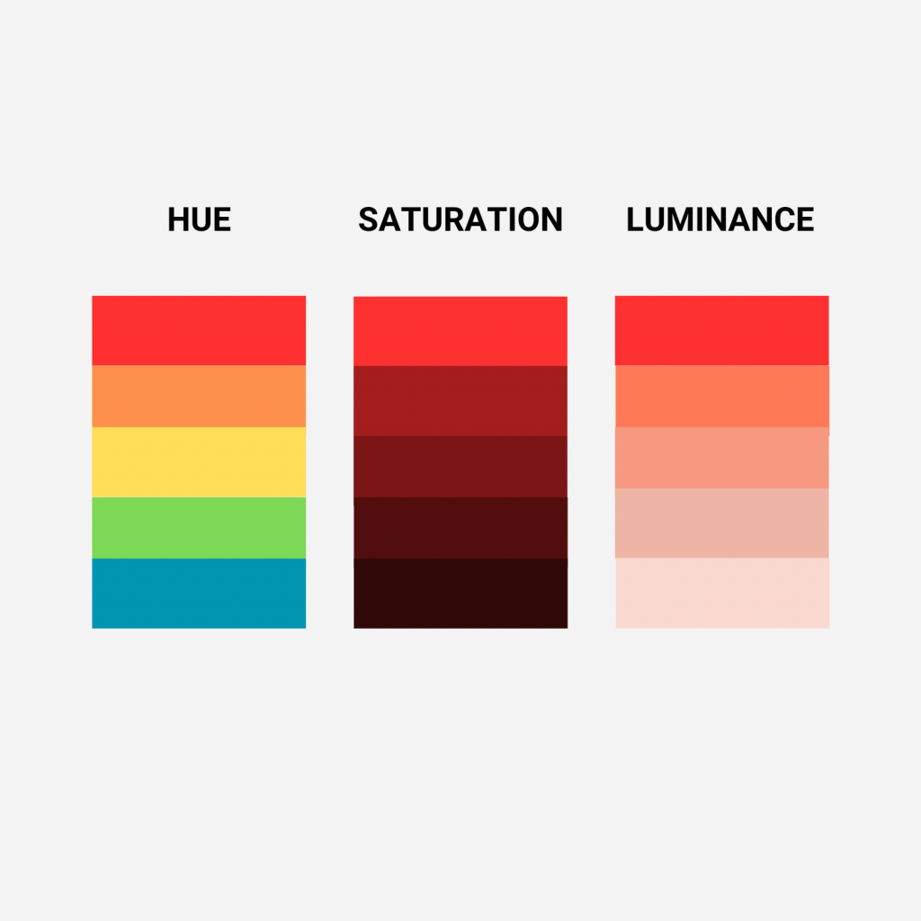
When selecting a color scheme, consider your brand's personality and target audience. Use color theory to guide your choices—complementary colors create harmony, while contrasting colors can draw attention to important elements. To ensure accessibility, assess color combinations for visual clarity, especially for those with color blindness. A cohesive website palette not only enhances visual appeal but also strengthens brand recognition. Ultimately, the right colors can help convey your message more effectively, leading to higher engagement and conversion rates.
5 Key Factors to Consider When Selecting Colors for Your Website Design
Choosing the right colors for your website design is crucial, as colors can greatly influence user perception and engagement. 1. Brand Identity is the first factor to consider; your color palette should align with your brand’s personality and values to create a cohesive identity. 2. Target Audience is another important aspect. Different demographics often respond to colors in unique ways, so it's essential to select shades that resonate with your audience. 3. Color Psychology plays a vital role in evoking emotions and guiding user behavior. For instance, blues can instill a sense of trust, while reds may create urgency.
In addition to considering brand identity and psychology, 4. Accessibility cannot be overlooked. It's important to choose color combinations that ensure readability and are accessible to users with visual impairments, such as color blindness. Check the contrast of your color choices to enhance usability. Lastly, 5. Consistency is key; maintaining a consistent color scheme throughout your website helps establish brand recognition and improves the overall user experience. By keeping these factors in mind, you can create a visually appealing and effective website design that captures and retains your visitors' attention.
What Colors Work Best Together? A Guide to Creating Harmonious Website Palettes
Choosing the right colors for your website is crucial in creating an inviting and cohesive user experience. What colors work best together? This question often arises in the design process. A harmonious color palette not only enhances the aesthetic appeal of your site but can also dictate the emotional response of your visitors. Some popular combinations include complementary colors, which are opposite each other on the color wheel, such as blue and orange, or analogous colors, which sit next to each other, like green, teal, and blue. These combinations ensure visual balance and can greatly improve user engagement.
When creating your website's palette, it's also essential to consider the psychology of colors. For example, blue evokes feelings of trust and reliability, making it ideal for finance-related websites, while yellow can inspire optimism and happiness, perfect for brands aimed at a younger audience. To create a successful palette, aim for a triadic color scheme that incorporates three colors spaced evenly around the color wheel. This approach allows for the use of one dominant color, complemented by two accent colors for visual interest, leading to an engaging and effective design.